Our Design Plan for an English Inspired Overhaul in This Dated Downtown Grand Rapids Condo
- Lauren Figueroa Interior Design
- Nov 27, 2019
- 3 min read
Updated: Apr 12, 2023
OOooooo I'm giddy about this one friends! Time for a little project update...
This project is right in the heart of downtown Grand Rapids! Our client—a young female attorney who is ROCKING at life—purchased this dated condo just a few months ago, and our delicious plans for the space are well underway!
Here's a little overview of our plans for the space:
Completely gut the kitchen; new, open plan with island, paneled fridge, and open shelving
New wood floors and lighting throughout
Update primary and guest bathrooms
Builtins + AWESOME wallpaper in the home office
New furniture for the following rooms:
Primary Bedroom
Guest Bedroom
Living Room
Here are a few BEFORE shots of the space:
// BEFORE //


So here's our plan...
We're going to open up the kitchen and reclaim some of what is currently a GIANT foyer. The fridge will be paneled to keep the cabinetry cohesive, and we'll add lots of storage in the island to make up for the lost storage.

We'll move the dining area toward the kitchen, and because the footprint of the great room is quite long and skinny, we arranged the seating area to the left of the fireplace rather than centering it to keep a functional walkway. The bedroom layouts are pretty straightforward.
Our client's style profile was english inspired/global/Harry Potter—whom I adore, btw, so that wasn't a hard project to say YES to!
And now...for the style boards!
Our color palette through out is...can you guess...fairly neutral! But with lots of blue, blush, gold and green tones mixed in. I'm LOVING this palette.
We also plan to use lots of amazing hand-knotted vintage inspired rugs for this project...so that's a wonderful thing :)

In the kitchen we're going with suuuuuper dark blue almost black cabinets beautiful brushed gold accents. We're having all the cabinetry custom made by our favorite local carpentry, so we're SUPER pumped about that!!


For the guest bath, the design is based around keeping the honeycomb gold tile in the shower. We're bringing in some snazzy glass herringbone tiles to be the backdrop of the mirror, and mixing some gold to glam up the space a bit:

In the guest bed, we have have a lovely new bed frame, wall mounted lamps, and adorable transitional bedside tables. We'll use some of our clients existing artwork and two of her current bookshelves. Since this will function as a guest room, we weren't particularly concerned with storage, especially since there is already a large closet in the space.

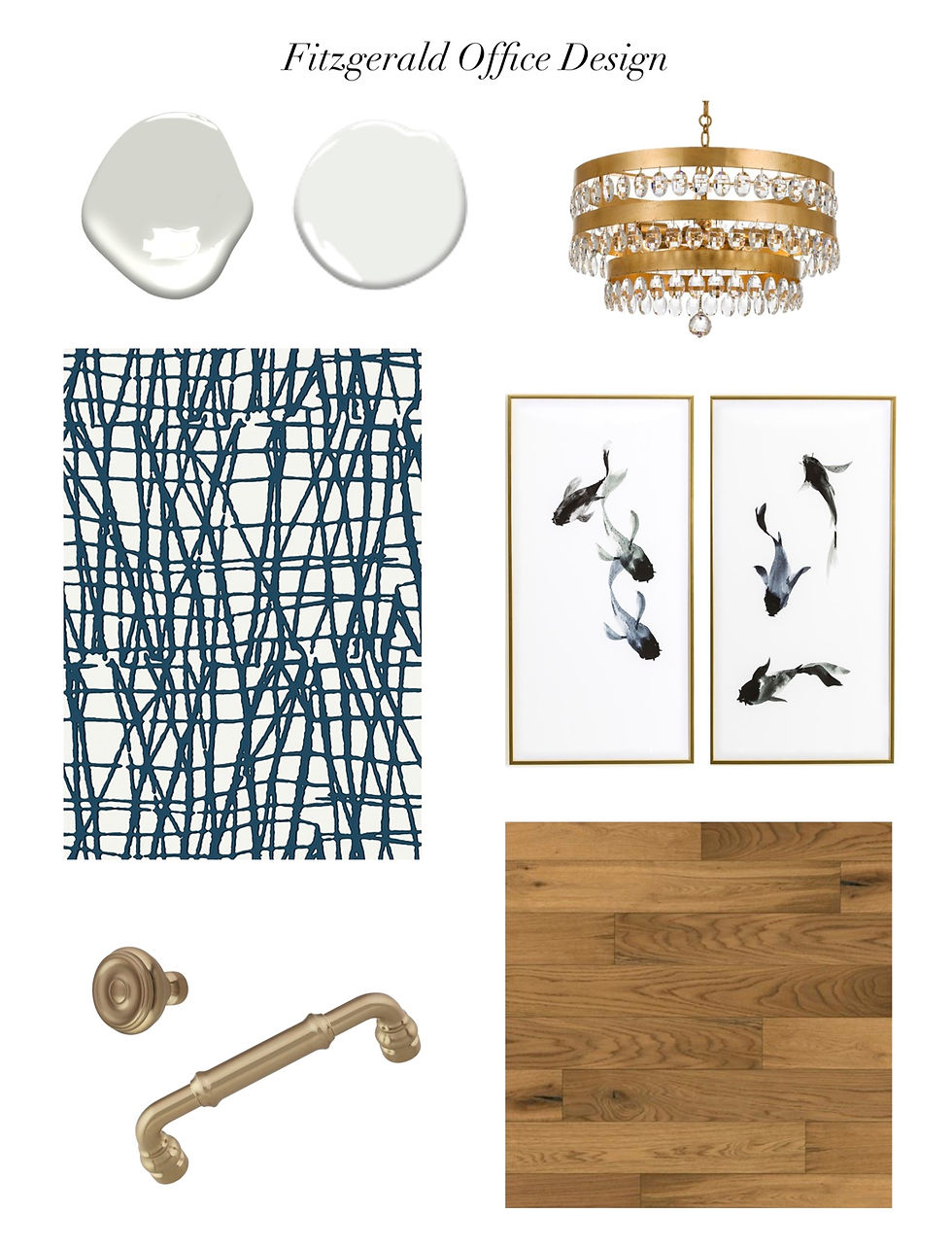
The little home office is basically SCREAMING for builtins, so our unit will include a desk in the center with filing drawings, which will be flanked by two upper cabinets and a floating shelf above.
The real PUNCH in this space will be the wallpaper behind the builtins. The unit itself will be a lovely white color, and the wallpaper behind will be a bold, dark blue. We'll bring in a fun light fixture in the gold accent, some calming artwork, and utilize one of her existing chairs with the desk.


The primary bedroom is my FAVORITE space so far for this project. It feels so...old AND new at the same time! Again, we have the blue, gold, grey, and neutrals going on.
We're bringing in an adorable chaise for some cozy seating for reading or lounging, and then new custom drapery to help tone down the strangeness of the window layout (see before picture above).
See also below our elevation for the bed wall, which shows how the draperies will be laid out so as to make the wall feel like one big window rather than two (somewhat strangely placed) smaller ones.


WHEW! Just writing this update post reminded me how much WORK has gone into this project so far!! Phase 2 of this design was a huge part of our summer and now well into fall, we're just beginning the construction phase.
It's so fun to work with clients on these large projects because they really do evolve and change and grow as we move through the project. These aren't spaces you can whip out in a day or two—we spend weeks (and in this case months) on these designs to make sure our clients are getting a super custom BESPOKE design.
So stay tuned! These after photos are going to be so goooooood!!
Work with Lauren Figueroa Interior Design
LFID is a full-service interior design firm serving West and Southeast Michigan known especially for our Designed in a Day service.
We work with clients from Detroit, to Grand Rapids, to Holland, to Traverse City, and anywhere in between, and we pride ourselves on creating bespoke, people-centered spaces—because after all, people are what this life is all about!
If you have a project on the horizon, get started by telling us a little about your vision here, and you can view past projects here. Thanks for stopping by!
