Alright, folks. Today we have an oldie but a goodie! This reveal was from before we were sending our blog out via our newsletter, so my guess is that a lot of you missed this one - which is just not okay!
SO. Today you'll get a peek into a kitchen makeover we took on in East Grand Rapids. The original kitchen was...eerrrr...I'll just say it: IT WAS BAD. It was so bad. Which is the best, because it makes for such a satisfying before and after!
The original kitchen (below) wasn't meeting our clients’ needs in several ways:
They liked to entertain and wanted a space that was functional and inviting for larger groups. Unfortunately, their kitchen was separated from the living room by multiple walls, making the space small and awkward for hosting.
The entryway caused issues when guests would arrive because it was so small and squished, so we wanted to address the traffic flow in the redesign.
There was also very little storage and no island - both things that our clients desired - but the footprint of the kitchen was actually quite large, leaving a significant amount of unused and awkward floorspace.
And lastly, the cabinets were a crazy lacquer white with clunky bulkheads above, paired with green countertops and green tile floors. SO MUCH GREEN. It was definitely time to take this space from dated and inconvenient to one that would bring our clients joy.
Lets take a look at what was...
// BEFORE //


Like, what is this, a concession counter? So odd...

Style Discovery
First things first: we needed to get a feel for our clients’ style preferences and functionality needs. In this phase, it’s all about communication and visuals.
This is where inspiration photos come into play (the more, the better!). Below is a snapshot of a few inspiration images our clients put together on Pinterest. During our project consultation, we looked through their images together and discussed color schemes, possible layouts, materials, as well as identified any design elements they definitely didn’t want to include.
Design Development
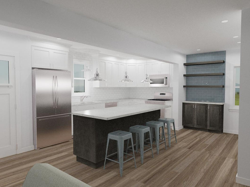
Once we got a feel for our clients’ style, we jumped into the detailed work of thinking through layout, flow, and function, as well as selecting the finishes, cabinetry, countertops, lighting, hardware, and fixtures. In the process, we played with several different cabinetry arrangements, island size, and the location of the fridge, as well as different storage options. Overall, we ended up with several similar but slightly different layouts, and we worked with a local company to develop renderings in order to give our clients a potential finished look:


Renderings by Complete Flooring and Interiors.
These images were ideal for giving our clients a sneak peak at what everything could look like when brought together. In the end, you'll notice, we ended up with a combination of the three.
The Finished Product
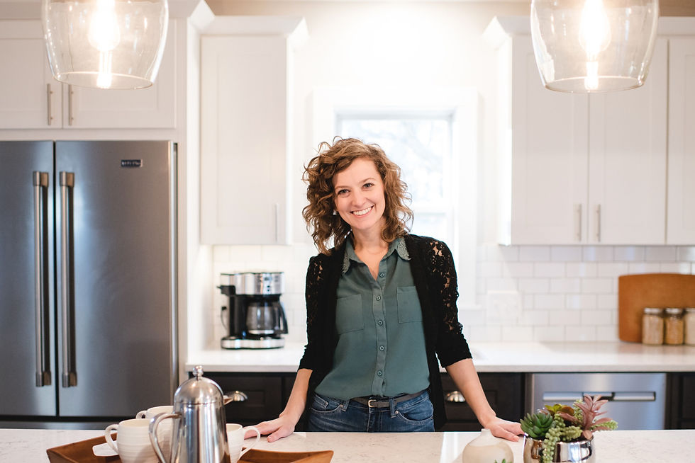
We're happy to say our clients were left with a beautiful and open kitchen perfect for cooking, relaxing and hosting all those wonderful gatherings.
You'll notice the walls cutting off the living room and entry way are both gone, so you enter the house and immediately feel you are at the heart of the home. People can now easily communicate from the kitchen to the living and dining areas, and there is now wayyy more counter space for both prepping and serving.
// BEFORE //

// AFTER //

// BEFORE //

// AFTER //


These beautiful custom floating shelves were built by the couple's grandfather and make for the perfect spot to display glassware and bar items.


There was zero seating in the original kitchen, but now the large island provides three additional seats perfect for casual gatherings or grabbing breakfast in the morning.


It's always a treat to walk with our clients through such a major transformation. As a designer, I know how great an impact our homes have on daily lives, and I'm honored to get the chance day after day to improve the wellbeing of our clients!
Work With Lauren Figueroa Interior Design
Are you ready to take on a kitchen makeover? LFID works with clients throughout west and southeast Michigan, and we pride ourselves in creating bespoke, people-centered spaces. We'd love to be your design team! Click here to tell us about your project.

